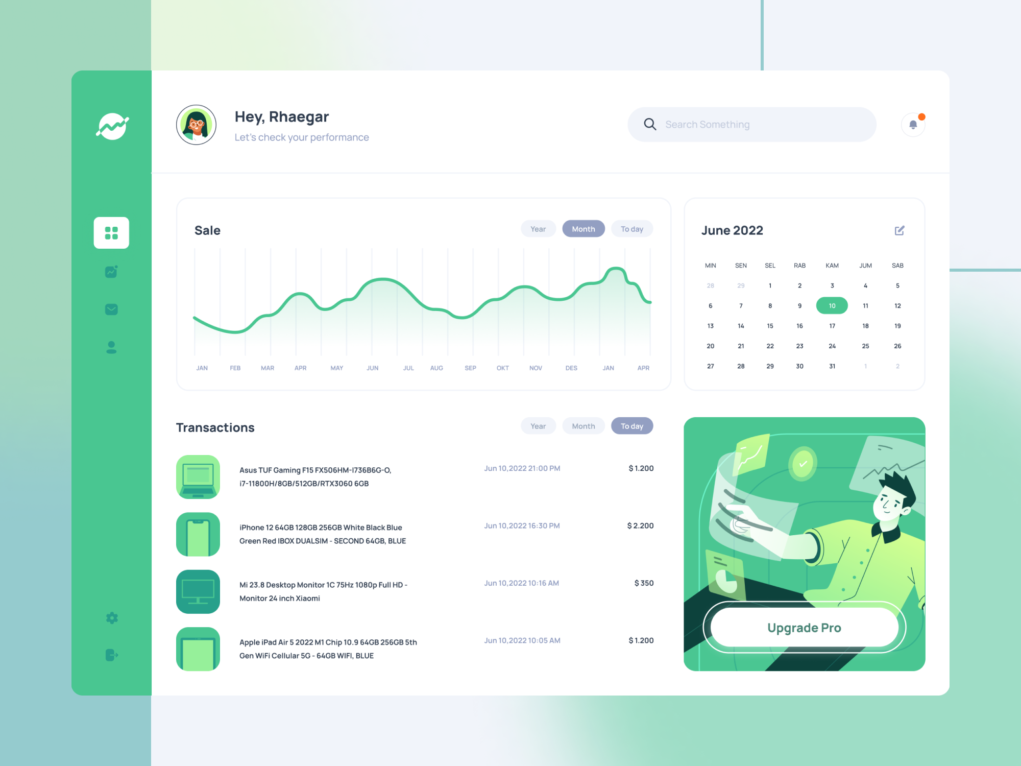
Sales dashboards are used to give reports and organize your company data effectively. It is unarguable that you need to respond and manage your business properly. Take a look at our latest exploration of creating a Sales Dashboard UI and the journey behind it.
In this exploration, we aimed to create a simple and elegant Sales Dashboard UI that includes numerous sales details, such as sales overview, transactions, and today’s money. We tried to carry out the idea and catch up with the users’ needs.
First thing first, we started with sketching to turn the information you have carefully gathered into a product vision. Then we start the wireframing to see the layout and elements taking shape. We really paid attention to every detail, the visual design, the usability, and even the psychology of the user itself.

Finally, it is time to start actually designing the project. It’s time to focus on colors and fonts and experiment with different layouts. Although it is just a casual exploration, we still asked for feedback from our relative designer friends so we could fix and make any important improvements for better work.
Voila! After those long processes and adding some final touches, here we got the final results. What do you think? Isn’t it cool?
Ready to make a masterpiece together?
Don’t hesitate to contact us now!

